It seems like I’m finding a new feature on Google every other week! About a month ago, Google launched Google Instant, the algorithm that predicts your search query as you’re typing it in and serves up results in real time. Just in the last week, I noticed two other new features that are quite interesting. Today, I’d like to talk about my thoughts on Google Instant and also these two new features. It’s really crazy. I’d venture to say that the once minimalist Google experience is starting to become feature rich!
My Mixed Thoughts On Google Instant
From a user’s perspective, I have mixed feelings on the topic of Google instant. I’m a quick typist so it doesn’t save me too much time. Moreover, I’m really missing the search box at the bottom of the search results page. I like scrolling through all the search results and entering my next search query at the bottom of the page, but I now need to scroll back to the top before entering my next query.
From a search marketing perspective, it’s possible that Google Instant will shift more traffic to head terms while taking away from tail terms. This is something I am monitoring closely and only time will tell if this hypothesis materializes.
Google New Feature # 1: Annoying Arrow
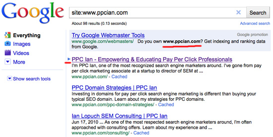
So, now the fun part – Following are some new features you may have not heard about yet. Check out the screenshot below. You see that little arrow on the left of the search results? This arrow started appearing for me last week. When I move the down arrow on my keyboard, it goes down to the next result on the page. It starts in the premium sponsored results, then goes to organic, then goes to the right rail of paid ads if you keep going down. When you hit enter, it actually clicks the result and goes to that website!
Here’s why I think the new feature is annoying: I’m a big fan of scrolling up and down with my arrow keys. Now, when I scroll down, everything is slower because the rate at which the Google arrow goes down is slower than the normal scrolling of the page. Also, if you scroll back up after going down, the arrow disappears at the top of the page, the cursor goes in the search box, and now you’re prevented from scrolling up and down at all! In short, I find this new feature annoying.
Google New Feature # 2: Promotional Ads That Reference The User’s Search Query
I’m going to close out with a feature that I really like. In the screenshot below, you will notice that I search for site:www.ppcian.com. Basically, I’m trying to see how many pages of my site have been indexed by Google. Check out the Google promotion ad at the top. It references the exact search query I’m buying!
Now, you may argue, "It’s not referencing your search query, Ian. Google is buying your URL and using keyword insertion." I’ll argue back, that’s simply not true. How do I know this? If I type in site:www.ppcian.com/* the trailing slash and star are also included in Google’s promotional ad. If I do it without the star, but with the slash, my exact query gets inserted again.
I’m really excited about this technology. It would really open up a world of opportunity if I could leverage dynamic insertion of the user’s raw query in my search ads. You may be thinking, what does the second query above mean (the one with the trailing slash and star)? Whereas the first one shows how many pages are in Google’s index, the second one shows how many pages are in the "real" index (and not the supplemental one). Definitely useful stuff in the world of SEO. What do you think about Google’s new feature rich approach?


